Prepwise
Dashboard
Prepwise
Dashboard
Prepwise
Dashboard
A conversion-focused landing page for an AI-powered interview preparation tool
A complete overall and redesign of the milestone component, made modern and responsive.
Scope
Dashboard
/
Company
PrepWise
/
Year
2026
View live
View Live
Background
Over the past two months, I collaborated with a product manager and two software engineers as the sole designer in CollabSprint, a structured product-building program, to design PrepWise. As the sole designer, I owned every touchpoint across the product, from the dashboard and landing page to the presentation slides.
PrepWise is an AI-powered interview preparation tool that lets users practice for upcoming interviews and run mock sessions, complete with detailed analytics on their performance and areas for improvement.
This case study walks through the design decisions and strategy behind it.
Over the past two months, I collaborated with a product manager and two software engineers as the sole designer in CollabSprint, a structured product-building program, to design PrepWise. As the sole designer, I owned every touchpoint across the product, from the dashboard and landing page to the presentation slides.
PrepWise is an AI-powered interview preparation tool that lets users practice for upcoming interviews and run mock sessions, complete with detailed analytics on their performance and areas for improvement.
This case study walks through the design decisions and strategy behind it.
Over the past two months, I collaborated with a product manager and two software engineers as the sole designer in CollabSprint, a structured product-building program, to design PrepWise. As the sole designer, I owned every touchpoint across the product, from the dashboard and landing page to the presentation slides.
PrepWise is an AI-powered interview preparation tool that lets users practice for upcoming interviews and run mock sessions, complete with detailed analytics on their performance and areas for improvement.
This case study walks through the design decisions and strategy behind it.

Research
Understanding the brief
The first step was making sense of what we were actually solving. I broke the brief down into two core areas: the problem and the vision.
The problem was clear. Interview prep is largely unstructured. People rely on random videos, generic question lists, and self-evaluation with no real feedback loop.
The vision was to change that with AI. Real feedback, structured practice, and personalized guidance based on where a user actually struggles, so they walk into interviews confident
The first step was making sense of what we were actually solving. I broke the brief down into two core areas: the problem and the vision.
The problem was clear. Interview prep is largely unstructured. People rely on random videos, generic question lists, and self-evaluation with no real feedback loop.
The vision was to change that with AI. Real feedback, structured practice, and personalized guidance based on where a user actually struggles, so they walk into interviews confident
The first step was making sense of what we were actually solving. I broke the brief down into two core areas: the problem and the vision.
The problem was clear. Interview prep is largely unstructured. People rely on random videos, generic question lists, and self-evaluation with no real feedback loop.
The vision was to change that with AI. Real feedback, structured practice, and personalized guidance based on where a user actually struggles, so they walk into interviews confident
Comparative analysis
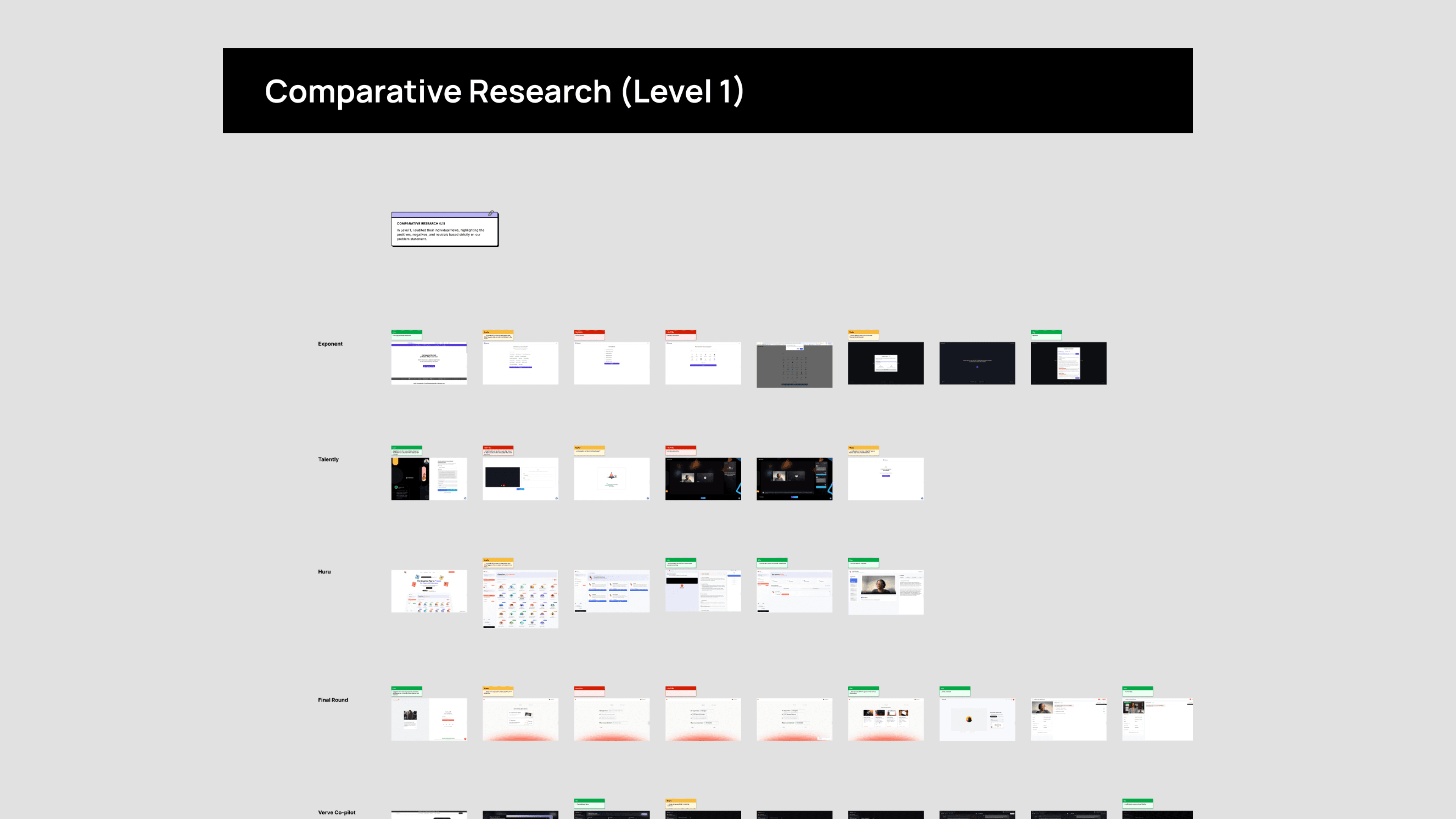
With a working MVP due on demo day at the end of the program, I was mindful of where to focus my research efforts. Rather than starting from scratch, I leaned into comparative analysis to understand what already existed in the space and identify opportunities to build on it.
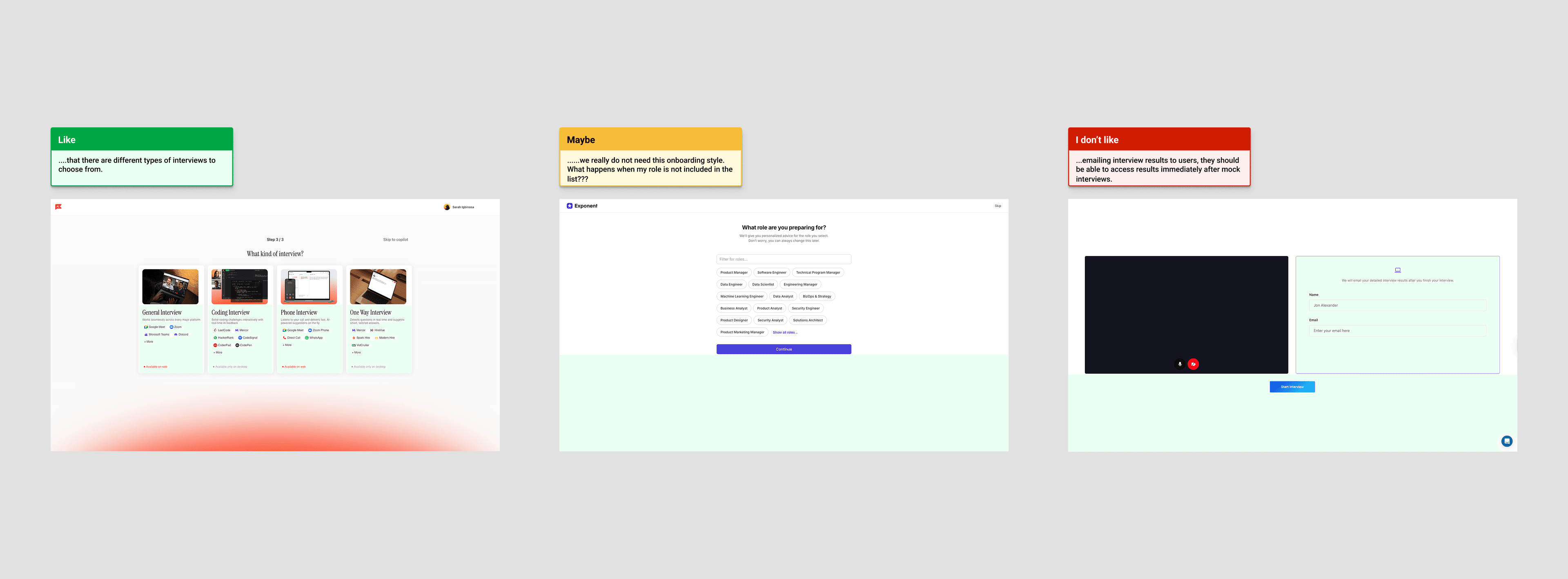
I conducted a comprehensive review of ten existing interview prep tools. I walked through the entire user flow, screenshotting every step and leaving comments as I went. I used a simple colour coding system to capture my reactions quickly: green for what worked well, yellow for moments worth reconsidering, and red for what did not work.
With a working MVP due on demo day at the end of the program, I was mindful of where to focus my research efforts. Rather than starting from scratch, I leaned into comparative analysis to understand what already existed in the space and identify opportunities to build on it.
I conducted a comprehensive review of ten existing interview prep tools. I walked through the entire user flow, screenshotting every step and leaving comments as I went. I used a simple colour coding system to capture my reactions quickly: green for what worked well, yellow for moments worth reconsidering, and red for what did not work.
With a working MVP due on demo day at the end of the program, I was mindful of where to focus my research efforts. Rather than starting from scratch, I leaned into comparative analysis to understand what already existed in the space and identify opportunities to build on it.
I conducted a comprehensive review of ten existing interview prep tools. I walked through the entire user flow, screenshotting every step and leaving comments as I went. I used a simple colour coding system to capture my reactions quickly: green for what worked well, yellow for moments worth reconsidering, and red for what did not work.
What Makes PrepWise Different?
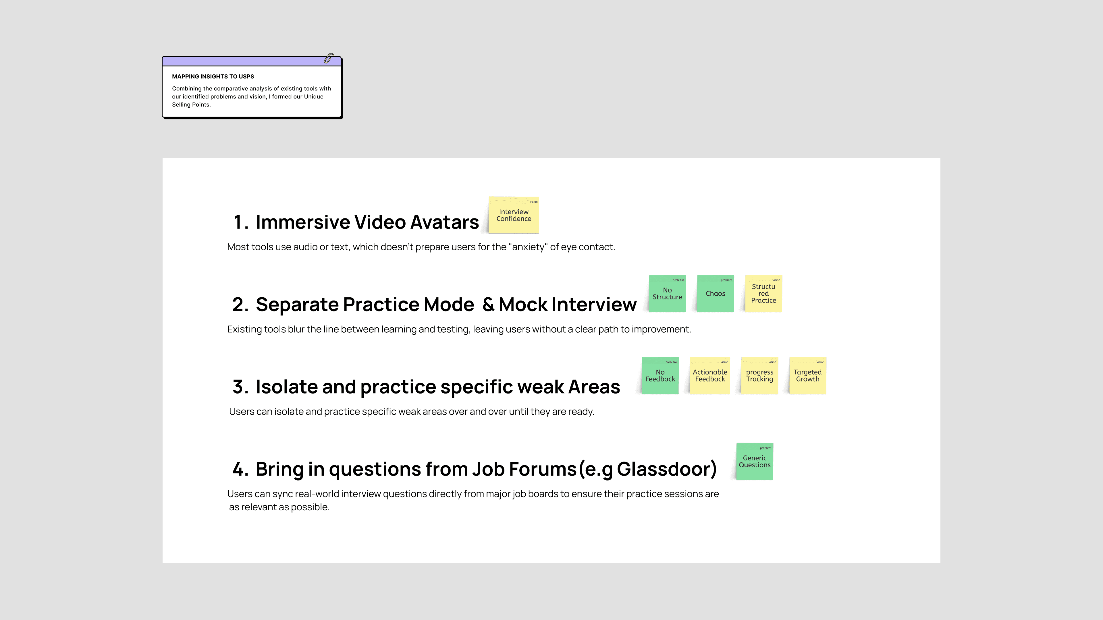
Combining insights from the comparative analysis with the problems identified in the brief, I defined the areas where PrepWise needed to stand out.
Immersive Video Avatars — Most existing tools rely on audio or text, which does not prepare users for the real pressure of eye contact in an interview. PrepWise uses video avatars to simulate that experience.
Separate Practice Mode and Mock Interview — Existing tools blur the line between learning and testing, leaving users without a clear path forward. PrepWise separates the two so users always know whether they are building skills or being evaluated.
Isolate and Practice Weak Areas — Users can identify and repeatedly target the specific areas they struggle with until they feel ready.
Bring in Questions from Job Forums — By syncing real questions from platforms like Glassdoor, practice sessions stay as relevant as possible to what users will actually face.
Combining insights from the comparative analysis with the problems identified in the brief, I defined the areas where PrepWise needed to stand out.
Immersive Video Avatars — Most existing tools rely on audio or text, which does not prepare users for the real pressure of eye contact in an interview. PrepWise uses video avatars to simulate that experience.
Separate Practice Mode and Mock Interview — Existing tools blur the line between learning and testing, leaving users without a clear path forward. PrepWise separates the two so users always know whether they are building skills or being evaluated.
Isolate and Practice Weak Areas — Users can identify and repeatedly target the specific areas they struggle with until they feel ready.
Bring in Questions from Job Forums — By syncing real questions from platforms like Glassdoor, practice sessions stay as relevant as possible to what users will actually face.
Combining insights from the comparative analysis with the problems identified in the brief, I defined the areas where PrepWise needed to stand out.
Immersive Video Avatars — Most existing tools rely on audio or text, which does not prepare users for the real pressure of eye contact in an interview. PrepWise uses video avatars to simulate that experience.
Separate Practice Mode and Mock Interview — Existing tools blur the line between learning and testing, leaving users without a clear path forward. PrepWise separates the two so users always know whether they are building skills or being evaluated.
Isolate and Practice Weak Areas — Users can identify and repeatedly target the specific areas they struggle with until they feel ready.
Bring in Questions from Job Forums — By syncing real questions from platforms like Glassdoor, practice sessions stay as relevant as possible to what users will actually face.
Building
Overview
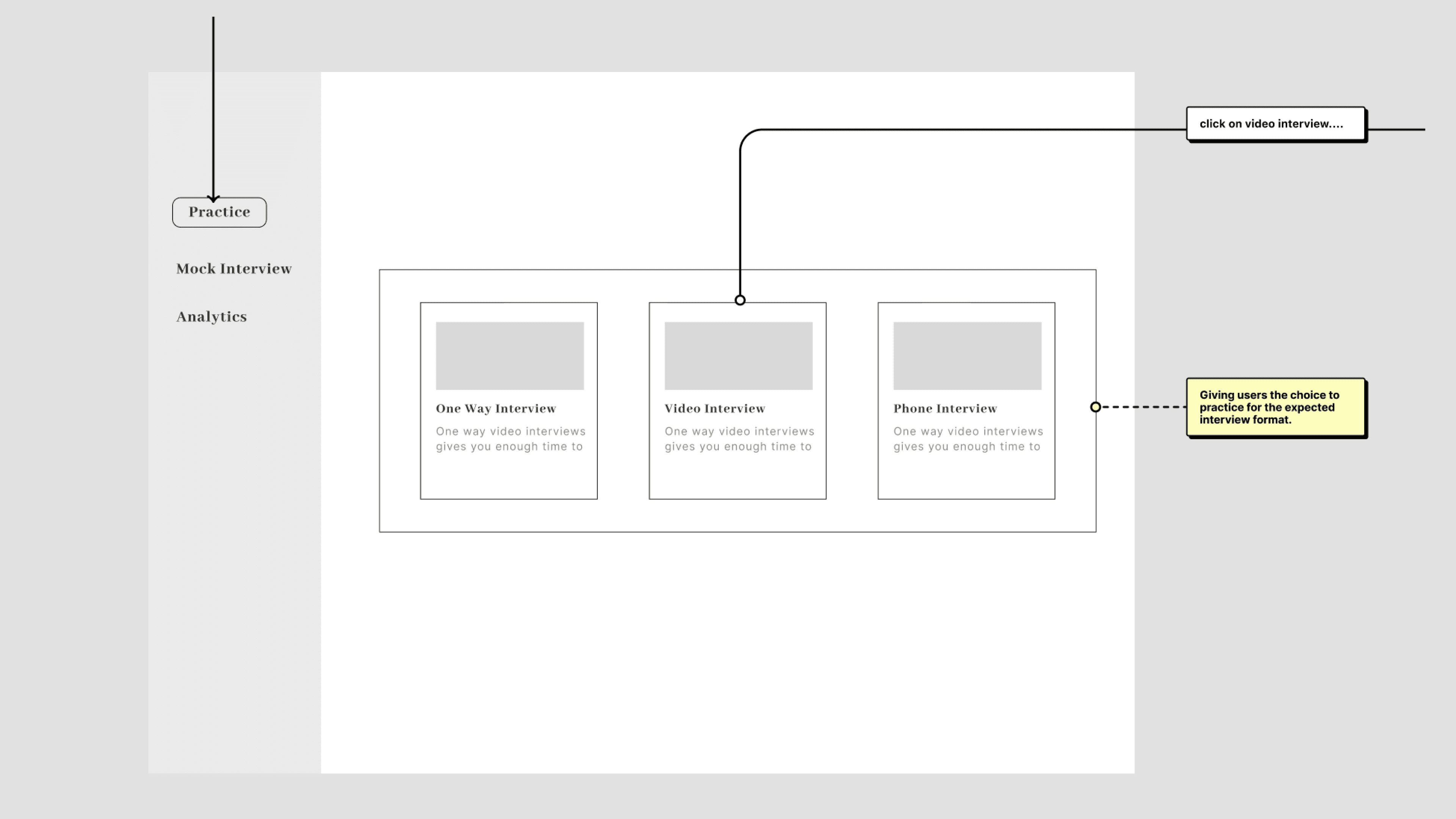
Before jumping into high fidelity screens, I created a simple wireframe to map out the full scope of what needed to be built. This gave me a clear overview and helped frame the key design questions for each section.
Dashboard — What should users see the moment they land, and how do we make the next action obvious?
Practice — How can AI be used to actively guide users toward better answers during a session?
Mock interview — At what point do I signal to users that this is a real simulation with no AI assistance?
Analytics page — How do I present performance results in a way that is clear, actionable, and not overwhelming?
Before jumping into high fidelity screens, I created a simple wireframe to map out the full scope of what needed to be built. This gave me a clear overview and helped frame the key design questions for each section.
Dashboard — What should users see the moment they land, and how do we make the next action obvious?
Practice — How can AI be used to actively guide users toward better answers during a session?
Mock interview — At what point do I signal to users that this is a real simulation with no AI assistance?
Analytics page — How do I present performance results in a way that is clear, actionable, and not overwhelming?
Before jumping into high fidelity screens, I created a simple wireframe to map out the full scope of what needed to be built. This gave me a clear overview and helped frame the key design questions for each section.
Dashboard — What should users see the moment they land, and how do we make the next action obvious?
Practice — How can AI be used to actively guide users toward better answers during a session?
Mock interview — At what point do I signal to users that this is a real simulation with no AI assistance?
Analytics page — How do I present performance results in a way that is clear, actionable, and not overwhelming?
Dashboard
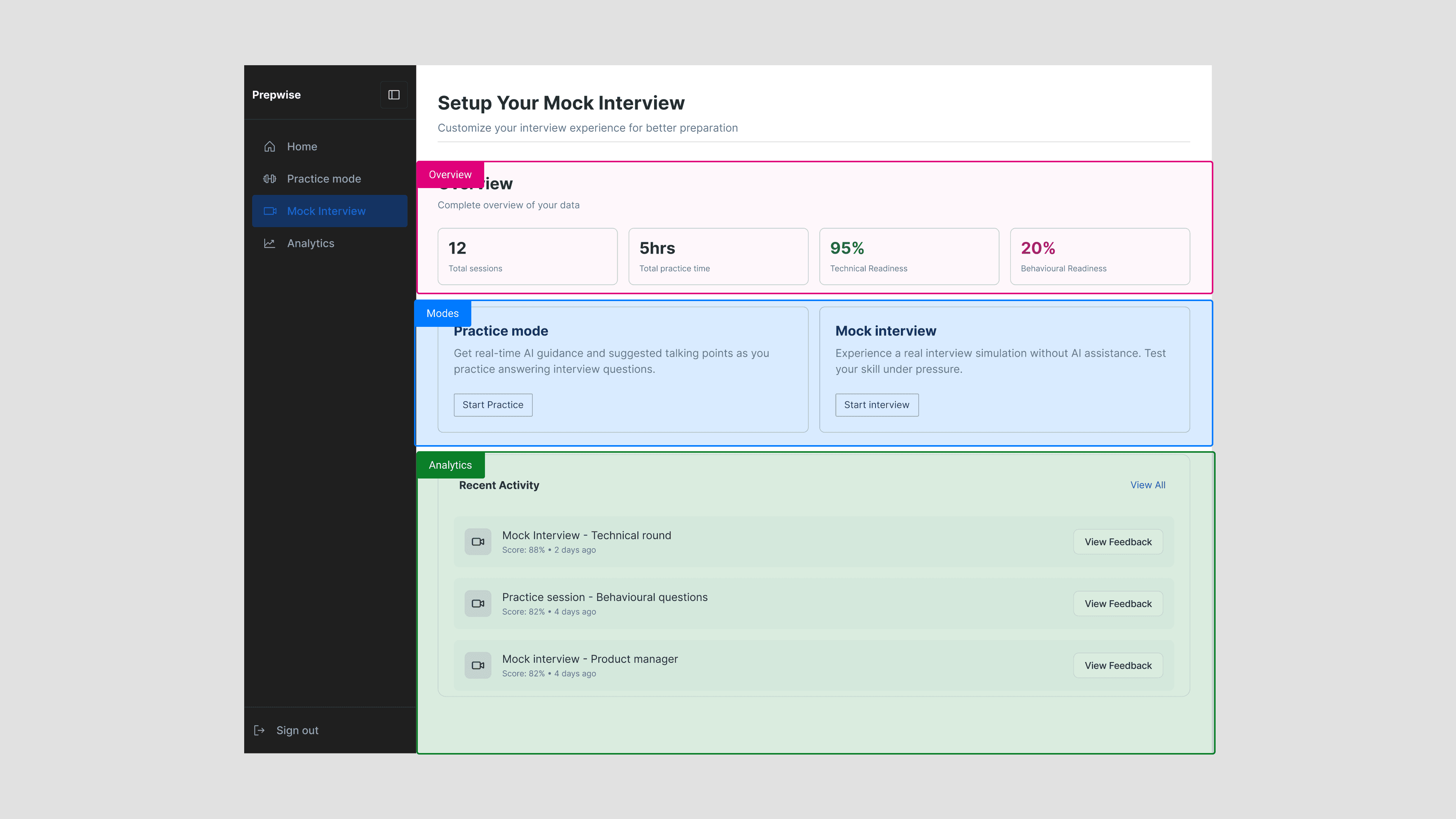
The dashboard was designed around one goal: give users a clear picture of where they stand and make the next action effortless.
It is structured into three distinct areas. The overview surfaces key metrics at a glance, total sessions, practice time, and readiness scores across technical and behavioural categories. The modes section sits prominently in the middle, giving users direct access to either practice mode or a mock interview without any extra navigation. Below that, recent activity pulls in the latest sessions with scores and quick links to feedback, so progress is never more than one click away.
The dashboard was designed around one goal: give users a clear picture of where they stand and make the next action effortless.
It is structured into three distinct areas. The overview surfaces key metrics at a glance, total sessions, practice time, and readiness scores across technical and behavioural categories. The modes section sits prominently in the middle, giving users direct access to either practice mode or a mock interview without any extra navigation. Below that, recent activity pulls in the latest sessions with scores and quick links to feedback, so progress is never more than one click away.
The dashboard was designed around one goal: give users a clear picture of where they stand and make the next action effortless.
It is structured into three distinct areas. The overview surfaces key metrics at a glance, total sessions, practice time, and readiness scores across technical and behavioural categories. The modes section sits prominently in the middle, giving users direct access to either practice mode or a mock interview without any extra navigation. Below that, recent activity pulls in the latest sessions with scores and quick links to feedback, so progress is never more than one click away.
Practice
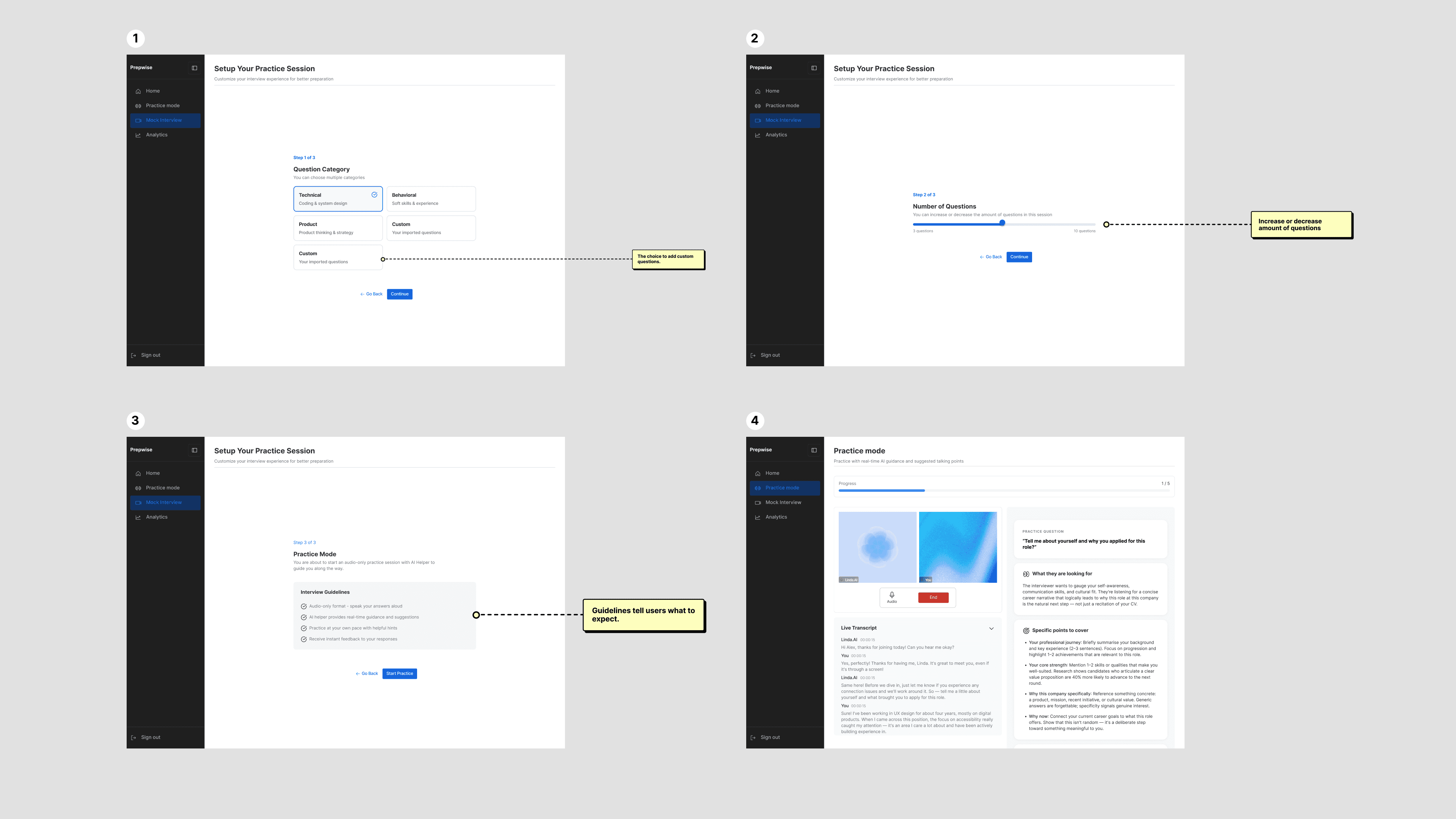
The practice flow was built around user control. Rather than a one-size-fits-all session, users can select a specific question category, technical, behavioural, product, or custom, so they can target exactly where they need the most work. They can also import their own questions and set the number of questions per session.
Before starting, a guidelines screen sets expectations for what the AI assisted session will look like. Once in, users get real-time guidance and suggested talking points alongside a live transcript, making it feel less like a test and more like a structured coaching session.
The practice flow was built around user control. Rather than a one-size-fits-all session, users can select a specific question category, technical, behavioural, product, or custom, so they can target exactly where they need the most work. They can also import their own questions and set the number of questions per session.
Before starting, a guidelines screen sets expectations for what the AI assisted session will look like. Once in, users get real-time guidance and suggested talking points alongside a live transcript, making it feel less like a test and more like a structured coaching session.
The practice flow was built around user control. Rather than a one-size-fits-all session, users can select a specific question category, technical, behavioural, product, or custom, so they can target exactly where they need the most work. They can also import their own questions and set the number of questions per session.
Before starting, a guidelines screen sets expectations for what the AI assisted session will look like. Once in, users get real-time guidance and suggested talking points alongside a live transcript, making it feel less like a test and more like a structured coaching session.
Mock Interview
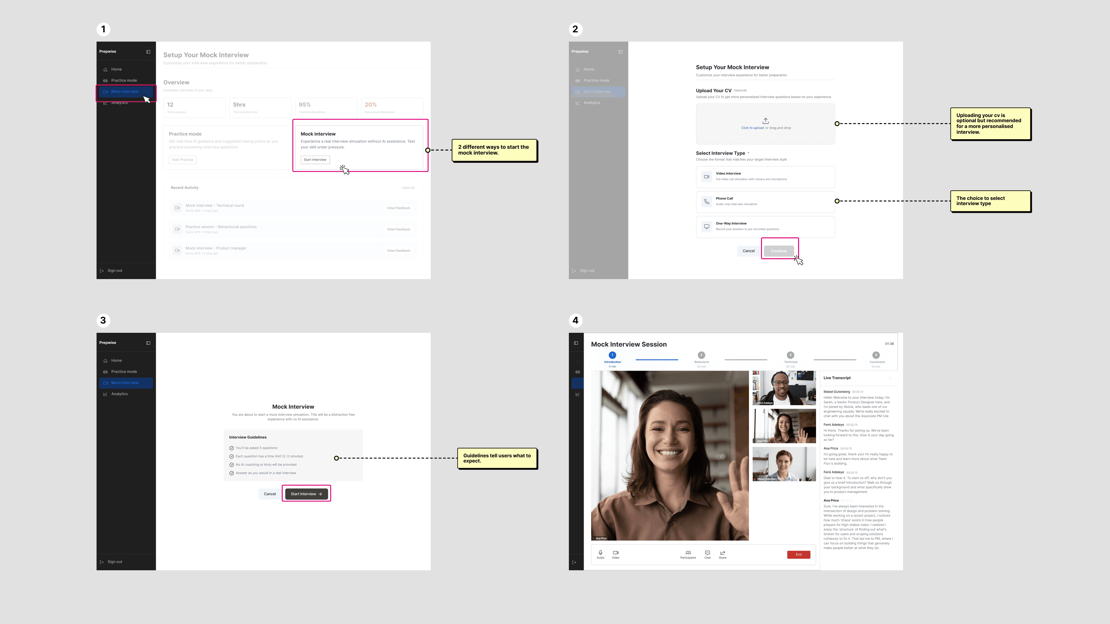
The mock interview flow was designed to be as frictionless as possible. Users select their interview type, with CV upload available as an optional step for a more personalised experience, respecting those uncomfortable sharing personal details online.
Before the session begins, a brief instructional screen sets clear expectations, reminding users this is a real simulation with no AI guidance. A small but deliberate design decision to put users in the right mindset before the interview starts.
The mock interview flow was designed to be as frictionless as possible. Users select their interview type, with CV upload available as an optional step for a more personalised experience, respecting those uncomfortable sharing personal details online.
Before the session begins, a brief instructional screen sets clear expectations, reminding users this is a real simulation with no AI guidance. A small but deliberate design decision to put users in the right mindset before the interview starts.
The mock interview flow was designed to be as frictionless as possible. Users select their interview type, with CV upload available as an optional step for a more personalised experience, respecting those uncomfortable sharing personal details online.
Before the session begins, a brief instructional screen sets clear expectations, reminding users this is a real simulation with no AI guidance. A small but deliberate design decision to put users in the right mindset before the interview starts.
Analytics
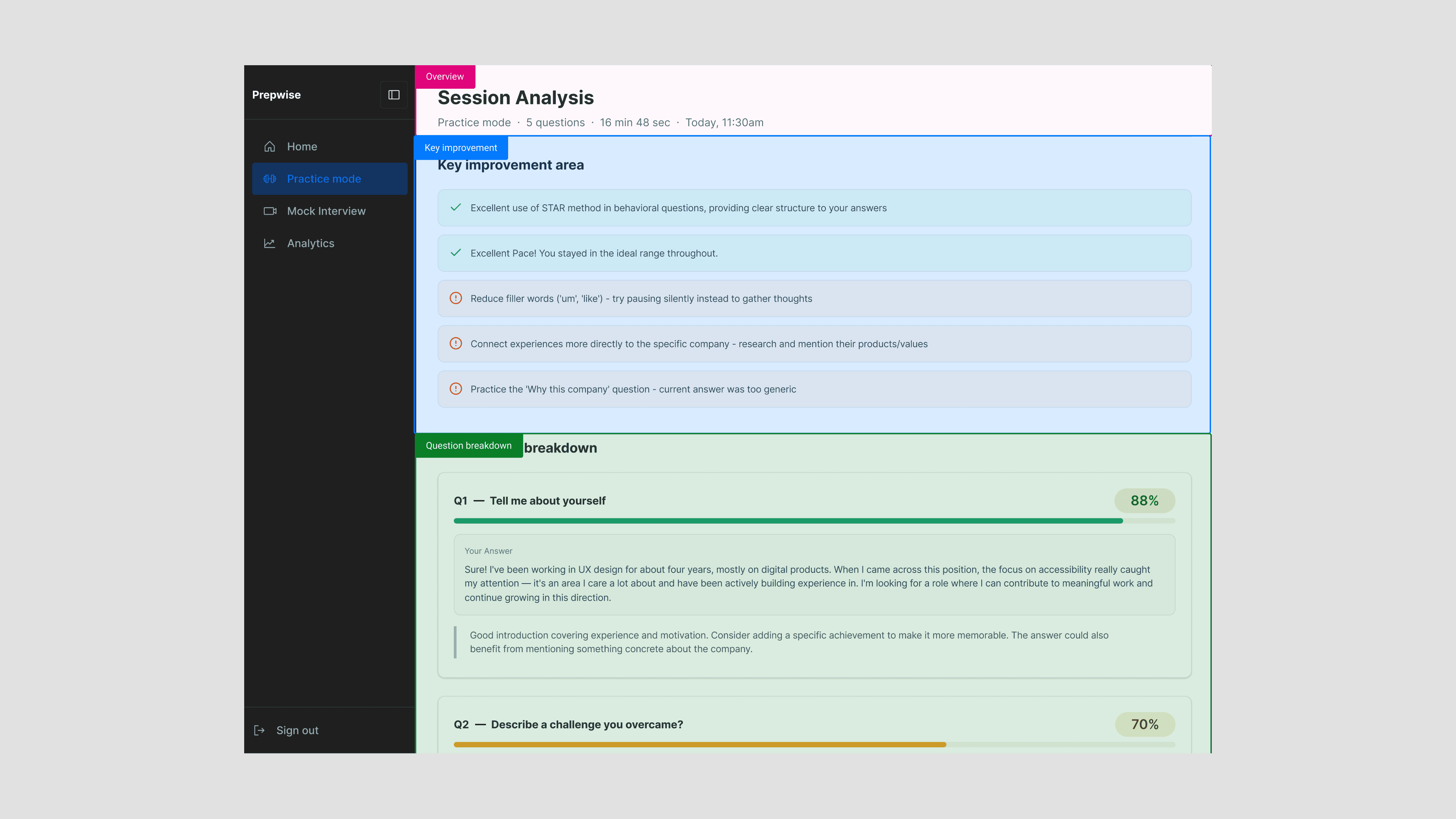
The analytics page was designed to make results feel actionable, not overwhelming. It is structured into three sections: a session overview showing key details like date, duration, and number of questions, a key improvements summary highlighting what went well and what needs work, and a question by question breakdown with scores and specific feedback for each answer.
Placing the summary above the fold was a deliberate choice. Users may not scroll through every question immediately, but they should always leave with a clear sense of their biggest wins and areas to focus on next.
The analytics page was designed to make results feel actionable, not overwhelming. It is structured into three sections: a session overview showing key details like date, duration, and number of questions, a key improvements summary highlighting what went well and what needs work, and a question by question breakdown with scores and specific feedback for each answer.
Placing the summary above the fold was a deliberate choice. Users may not scroll through every question immediately, but they should always leave with a clear sense of their biggest wins and areas to focus on next.
The analytics page was designed to make results feel actionable, not overwhelming. It is structured into three sections: a session overview showing key details like date, duration, and number of questions, a key improvements summary highlighting what went well and what needs work, and a question by question breakdown with scores and specific feedback for each answer.
Placing the summary above the fold was a deliberate choice. Users may not scroll through every question immediately, but they should always leave with a clear sense of their biggest wins and areas to focus on next.

Lessons
This project was as much about collaboration as it was about design. The biggest takeaway was learning how to make focused decisions under a tight timeline. From the very first team meeting, we aligned on one clear goal: a working MVP by demo day. That single constraint shaped every decision throughout the process, helping the team stay focused and avoid scope creep.
Designing every touchpoint from the dashboard to the landing page gave me a deep appreciation for how each piece connects to the whole. Given more time, there is a lot I would explore further, but for an eight week sprint, shipping something functional, considered, and cohesive felt like the right win.
This project was as much about collaboration as it was about design. The biggest takeaway was learning how to make focused decisions under a tight timeline. From the very first team meeting, we aligned on one clear goal: a working MVP by demo day. That single constraint shaped every decision throughout the process, helping the team stay focused and avoid scope creep.
Designing every touchpoint from the dashboard to the landing page gave me a deep appreciation for how each piece connects to the whole. Given more time, there is a lot I would explore further, but for an eight week sprint, shipping something functional, considered, and cohesive felt like the right win.
This project was as much about collaboration as it was about design. The biggest takeaway was learning how to make focused decisions under a tight timeline. From the very first team meeting, we aligned on one clear goal: a working MVP by demo day. That single constraint shaped every decision throughout the process, helping the team stay focused and avoid scope creep.
Designing every touchpoint from the dashboard to the landing page gave me a deep appreciation for how each piece connects to the whole. Given more time, there is a lot I would explore further, but for an eight week sprint, shipping something functional, considered, and cohesive felt like the right win.
Other Projects
Other Projects
Currently available for full-time roles. Let's connect and discuss how I can contribute to your team.
Sarafinny04@gmail.com
Designed by me in Framer.
Copyright
2026 Sarah Igbinosa.