Milestone Module
Redesign
Milestone Module
Redesign
Milestone Module
Redesign
A complete overall and redesign of the milestone component,
made modern and responsive.
A complete overall and redesign of the milestone component, made modern and responsive.
Scope
Module Design
/
Company
Carl ZEISS AG
/
Year
2025
View live
View Live
Background
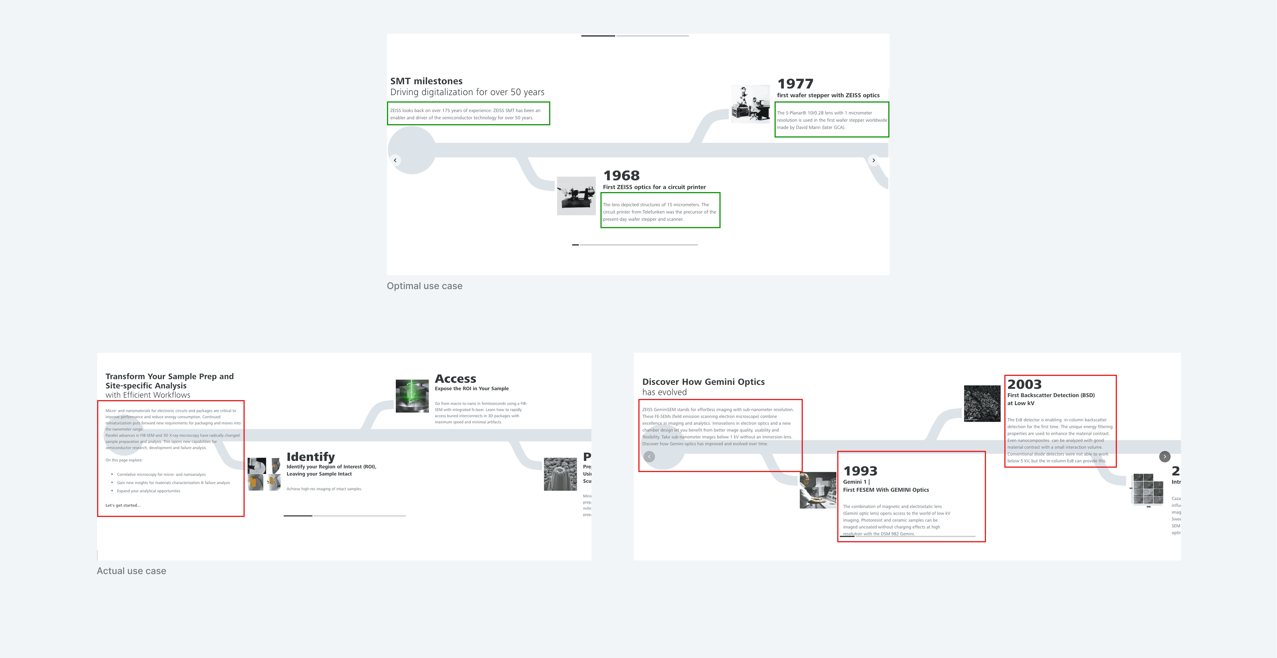
What began as a design request to refresh a visually outdated, decade-old "Timelime Module" evolved through my preliminary research into a full-scale strategic redesign. Recognizing that the existing structure could no longer support the diverse needs of our business units, I expanded the scope to build a more functional architecture.
What began as a design request to refresh a visually outdated, decade-old "Timelime Module" evolved through my preliminary research into a full-scale strategic redesign. Recognizing that the existing structure could no longer support the diverse needs of our business units, I expanded the scope to build a more functional architecture.
What began as a design request to refresh a visually outdated, decade-old "Timelime Module" evolved through my preliminary research into a full-scale strategic redesign. Recognizing that the existing structure could no longer support the diverse needs of our business units, I expanded the scope to build a more functional architecture.
Process
Early Exploration and a Key Lesson
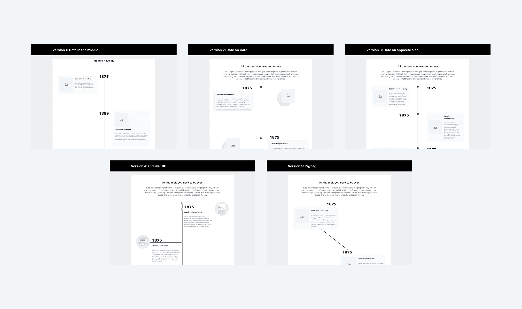
In the early stages of this design request, I followed my initial instinct to dive straight into visual exploration, producing five distinct iterations for the Milestone section. However, this phase served as a pivotal learning moment; I soon realized that by jumping immediately into the creative process, I had bypassed the essential groundwork required to solve the component’s underlying structural issues.
In the early stages of this design request, I followed my initial instinct to dive straight into visual exploration, producing five distinct iterations for the Milestone section. However, this phase served as a pivotal learning moment; I soon realized that by jumping immediately into the creative process, I had bypassed the essential groundwork required to solve the component’s underlying structural issues.
In the early stages of this design request, I followed my initial instinct to dive straight into visual exploration, producing five distinct iterations for the Milestone section. However, this phase served as a pivotal learning moment; I soon realized that by jumping immediately into the creative process, I had bypassed the essential groundwork required to solve the component’s underlying structural issues.
Analysis and Audit
To course-correct, I transitioned into a rigorous analysis and audit phase to determine exactly how the existing component was being utilized across various business units. I collaborated closely with an engineer to extract relevant usage data, which I then organized into a comprehensive spreadsheet to map out every active instance and edge case.
To course-correct, I transitioned into a rigorous analysis and audit phase to determine exactly how the existing component was being utilized across various business units. I collaborated closely with an engineer to extract relevant usage data, which I then organized into a comprehensive spreadsheet to map out every active instance and edge case.
To course-correct, I transitioned into a rigorous analysis and audit phase to determine exactly how the existing component was being utilized across various business units. I collaborated closely with an engineer to extract relevant usage data, which I then organized into a comprehensive spreadsheet to map out every active instance and edge case.
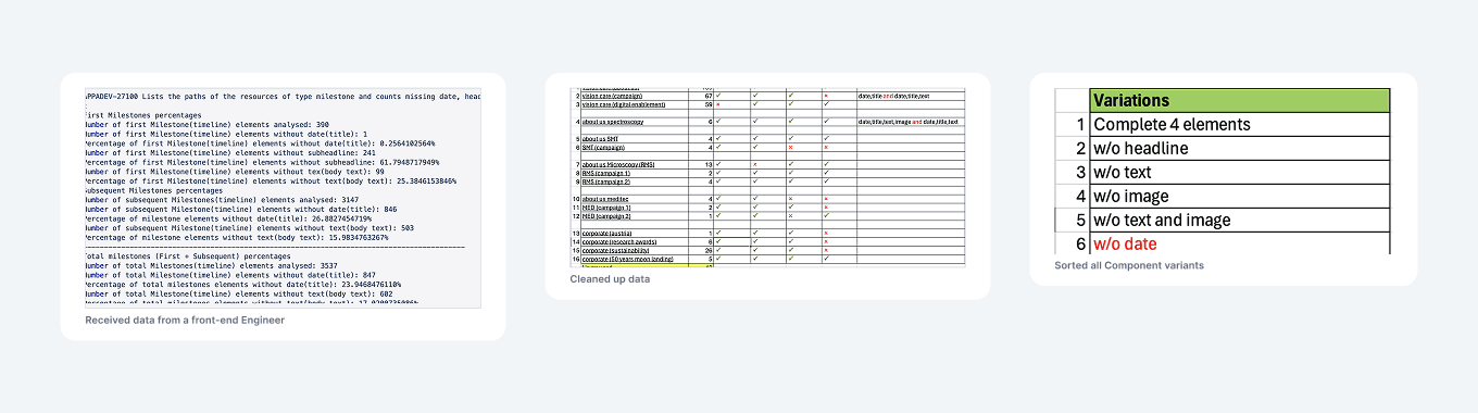
This analysis provided a clear picture of which business units use the component and how, while highlighting consistent patterns and defining the constraints for the upcoming design phase.
This analysis provided a clear picture of which business units use the component and how, while highlighting consistent patterns and defining the constraints for the upcoming design phase.
This analysis provided a clear picture of which business units use the component and how, while highlighting consistent patterns and defining the constraints for the upcoming design phase.
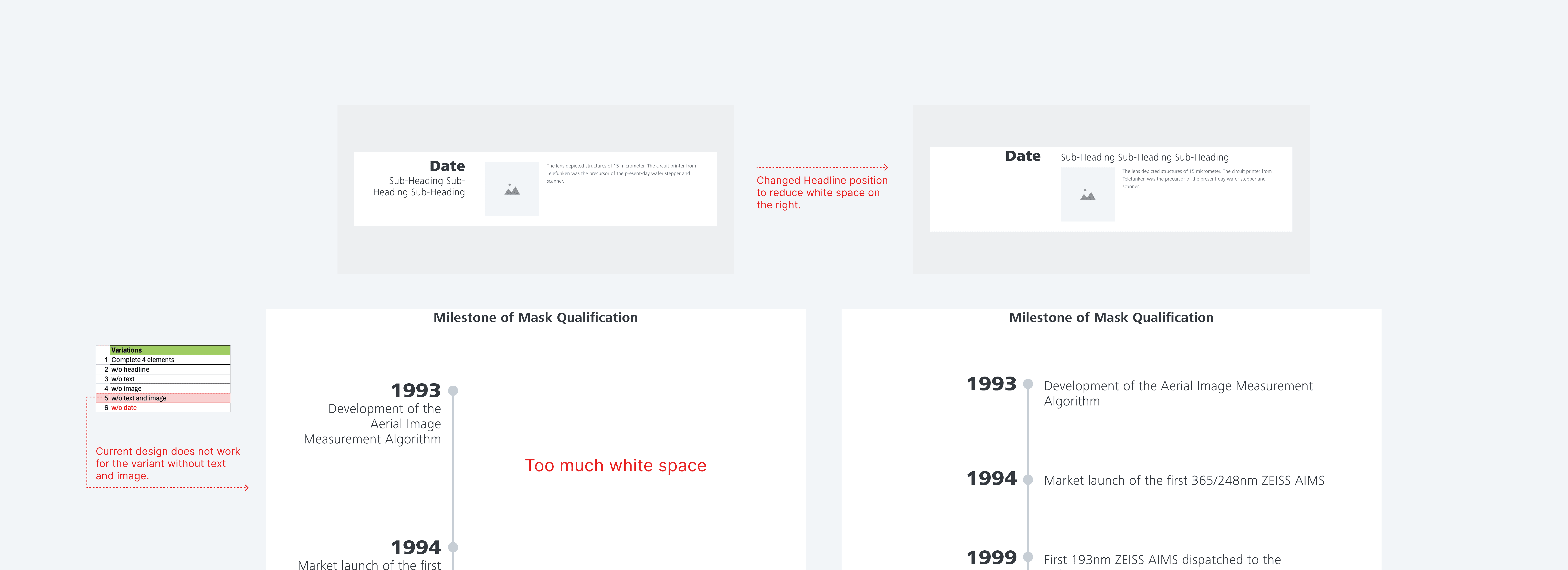
This step also made it easier to eliminate ideas that were not feasible. For example, one preferred design direction proved incompatible with a use case.
This step also made it easier to eliminate ideas that were not feasible. For example, one preferred design direction proved incompatible with a use case.
This step also made it easier to eliminate ideas that were not feasible. For example, one preferred design direction proved incompatible with a use case.
Building the Components and Module
Components
Using these insights, I adopted an Atomic Design approach. I built a "Milestone Card" component in the ZEISS library that was flexible enough to handle a range of content scenarios. The component adapts to the content. If a business unit does not require an image, the component automatically hides it.
Using these insights, I adopted an Atomic Design approach. I built a "Milestone Card" component in the ZEISS library that was flexible enough to handle a range of content scenarios. The component adapts to the content. If a business unit does not require an image, the component automatically hides it.
Using these insights, I adopted an Atomic Design approach. I built a "Milestone Card" component in the ZEISS library that was flexible enough to handle a range of content scenarios. The component adapts to the content. If a business unit does not require an image, the component automatically hides it.
Module
Using the component card i created, I then combined this with existing elements to create a module.
Using the component card i created, I then combined this with existing elements to create a module.
Using the component card i created, I then combined this with existing elements to create a module.
Documentation and Handoff
Components
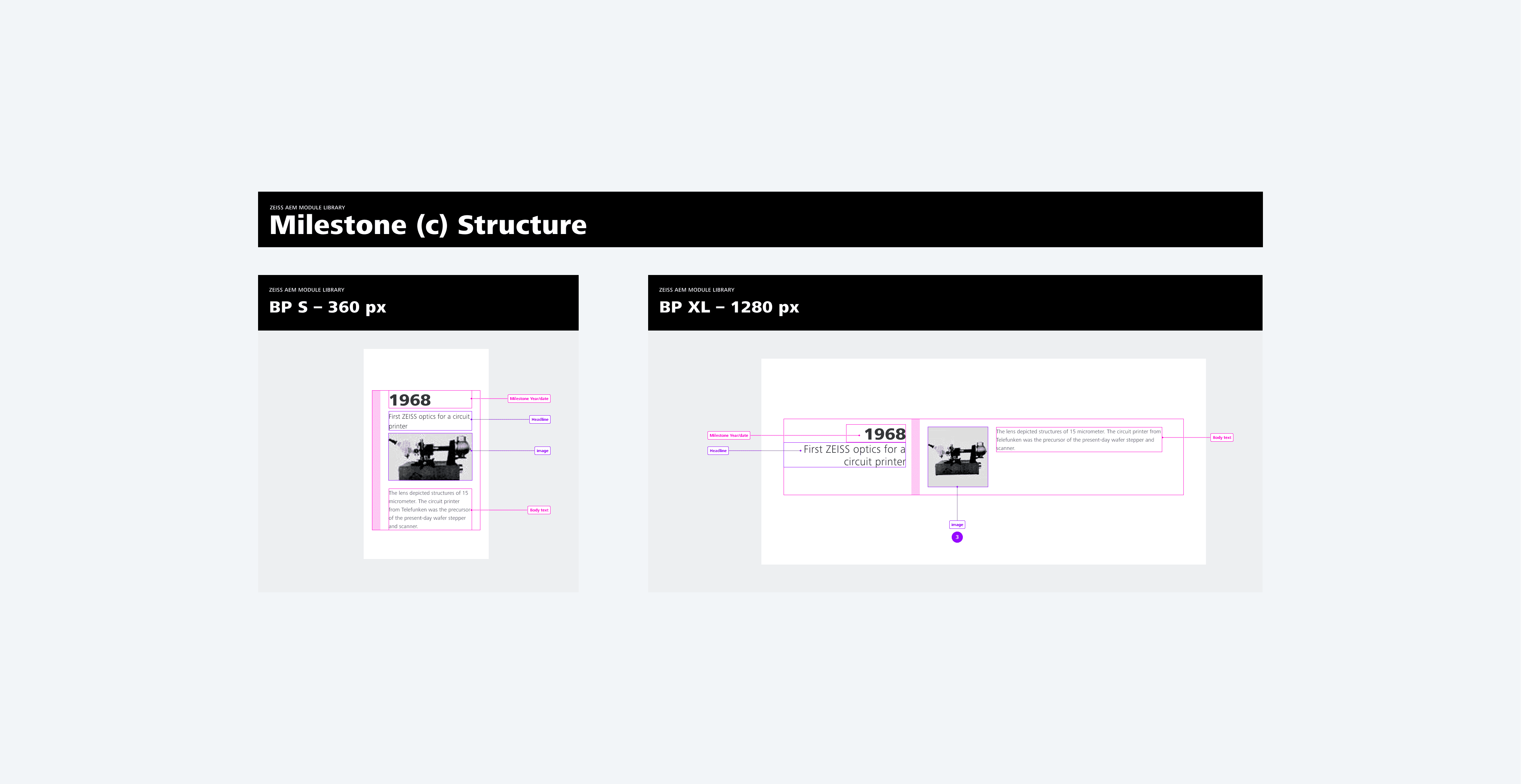
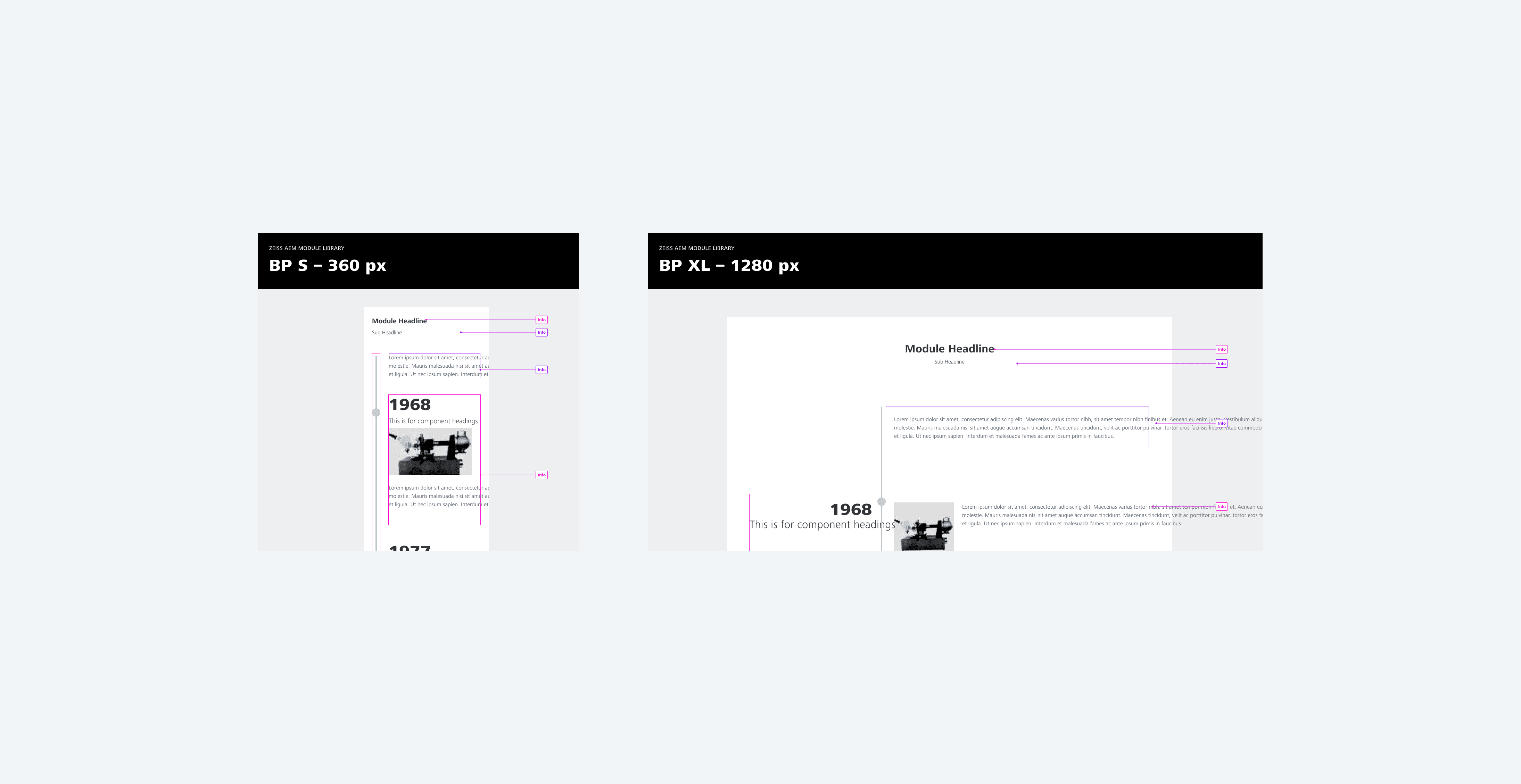
I established a comprehensive visual guide for the module's static elements—including defined grid systems, column distributions across breakpoints, and a "Do’s and Don’ts" usage framework—which proved so precise that when the feature was finally implemented months after my departure, the final version aligned perfectly with my documented specifications.
I established a comprehensive visual guide for the module's static elements—including defined grid systems, column distributions across breakpoints, and a "Do’s and Don’ts" usage framework—which proved so precise that when the feature was finally implemented months after my departure, the final version aligned perfectly with my documented specifications.
I established a comprehensive visual guide for the module's static elements—including defined grid systems, column distributions across breakpoints, and a "Do’s and Don’ts" usage framework—which proved so precise that when the feature was finally implemented months after my departure, the final version aligned perfectly with my documented specifications.
Prototype Built in Figma
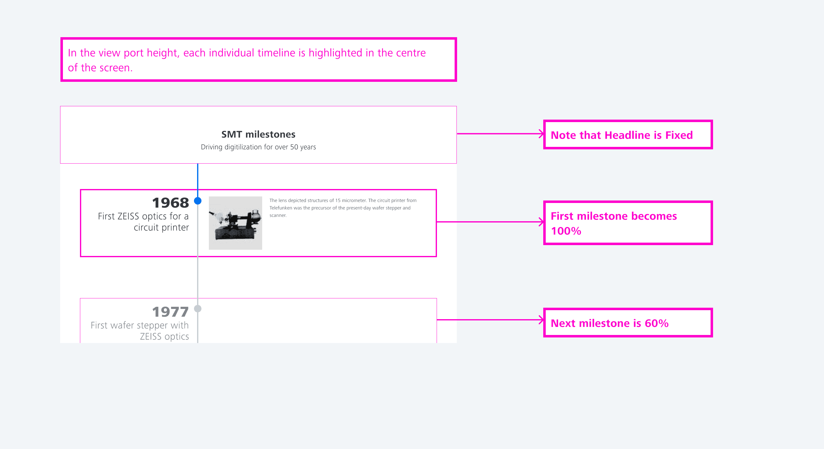
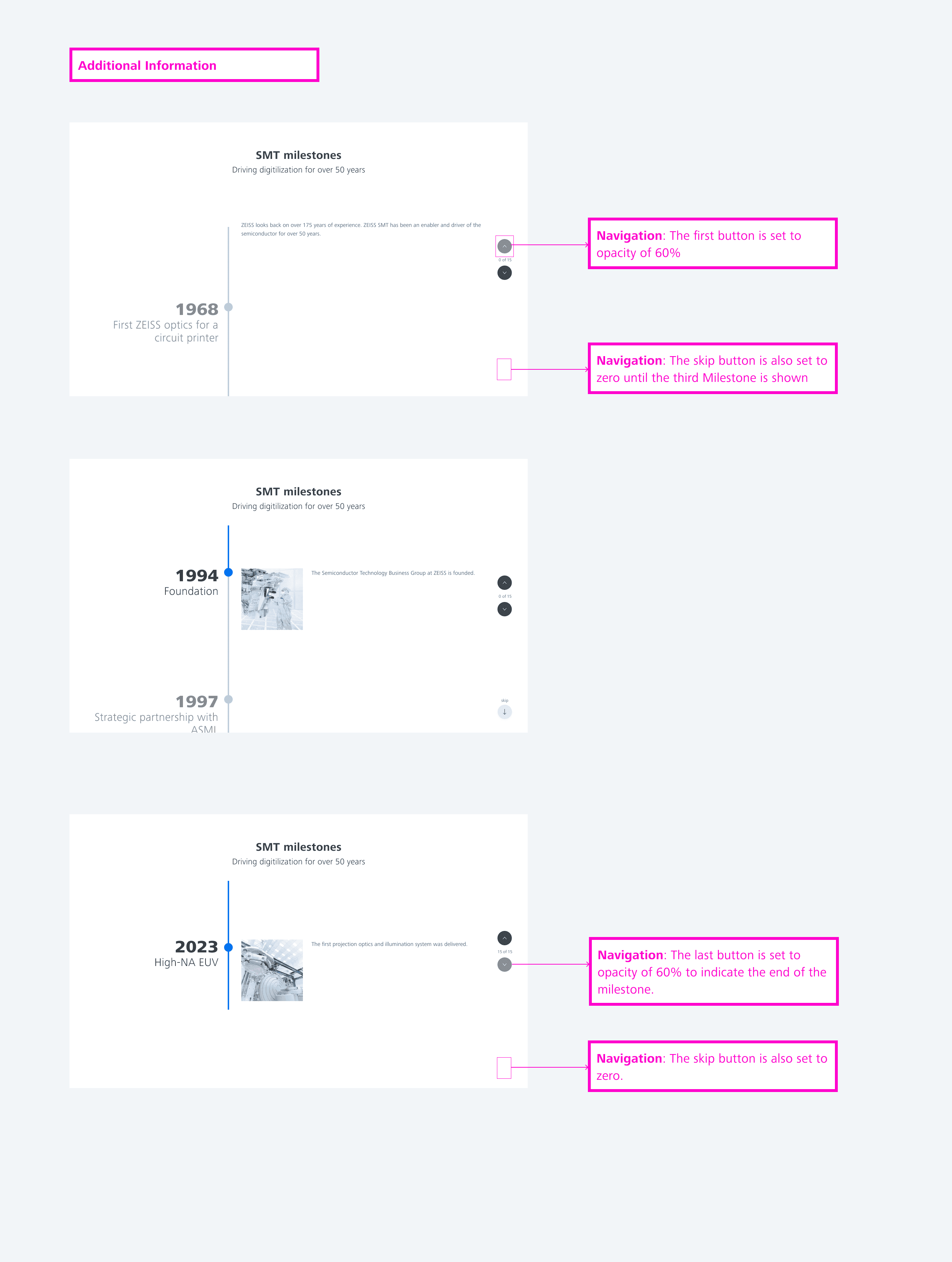
Prototyping is one of my favourite stages because it allows me to communicate ideas clearly to both designers and non-technical colleagues. I created an interactive prototype to demonstrate core interactions and layout. While this version was not final, it served as a strong foundation before development.
Prototyping is one of my favourite stages because it allows me to communicate ideas clearly to both designers and non-technical colleagues. I created an interactive prototype to demonstrate core interactions and layout. While this version was not final, it served as a strong foundation before development.
Prototyping is one of my favourite stages because it allows me to communicate ideas clearly to both designers and non-technical colleagues. I created an interactive prototype to demonstrate core interactions and layout. While this version was not final, it served as a strong foundation before development.
Use Case
This design is currently used in over 300 web pages. I have curated 4 cases using the 4 possible variants.
This design is currently used in over 300 web pages. I have curated 4 cases using the 4 possible variants.
01
ZEISS Vision Care
Date, Title, Text, Image
01
ZEISS Vision Care
Date, Title, Text, Image
01
ZEISS Vision Care
Date, Title, Text, Image
02
ZEISS Microscopy
Date, Text, Image
02
ZEISS Microscopy
Date, Text, Image
02
ZEISS Microscopy
Date, Text, Image
03
ZEISS Corporate
Date, Title, Text
03
ZEISS Corporate
Date, Title, Text
03
ZEISS Corporate
Date, Title, Text
04
ZEISS Meditec
Date, Title
04
ZEISS Meditec
Date, Title
04
ZEISS Meditec
Date, Title
Lessons Learned
Audit before Exploration
I learned that understanding a legacy system's usage is non-negotiable before starting visual work. Skipping a comprehensive audit leads to wasted effort on designs that cannot support existing technical requirements or business use cases.
Mobile First
While the final product was fully responsive, this project reinforced the importance of designing for the most constrained environment first. It shifted my approach toward a mobile-first methodology to ensure a more robust experience across all breakpoints.
Documentation is key
This project solidified my belief that precise documentation is essential for long-term success. Seeing the feature implemented exactly to my specifications months after my departure proved that clear handoffs save time and preserve design integrity.
Other Projects
Other Projects
Currently available for full-time roles. Let's connect and discuss how I can contribute to your team.
Sarafinny04@gmail.com
Designed by me in Framer.
Copyright
2026 Sarah Igbinosa.