Prepwise
Landing Page
Prepwise
Landing Page
Prepwise
Landing Page
A conversion-focused landing page for an AI-powered interview preparation tool
A complete overall and redesign of the milestone component, made modern and responsive.
Scope
Landing Page
/
Company
PrepWise
/
Year
2026
View live
View Live
Background
PrepWise is an AI-powered interview preparation tool that lets users practice for upcoming interviews and run mock sessions, complete with detailed analytics on their performance and areas for improvement. This section focuses on the design and strategy behind the landing page, a high-conversion gateway built to feel both professional and accessible. For a deeper look at the full product, design decisions, and strategy behind PrepWise, check out the main case study.
PrepWise is an AI-powered interview preparation tool that lets users practice for upcoming interviews and run mock sessions, complete with detailed analytics on their performance and areas for improvement. This section focuses on the design and strategy behind the landing page, a high-conversion gateway built to feel both professional and accessible. For a deeper look at the full product, design decisions, and strategy behind PrepWise, check out the main case study.
PrepWise is an AI-powered interview preparation tool that lets users practice for upcoming interviews and run mock sessions, complete with detailed analytics on their performance and areas for improvement. This section focuses on the design and strategy behind the landing page, a high-conversion gateway built to feel both professional and accessible. For a deeper look at the full product, design decisions, and strategy behind PrepWise, check out the main case study.
Hero Section
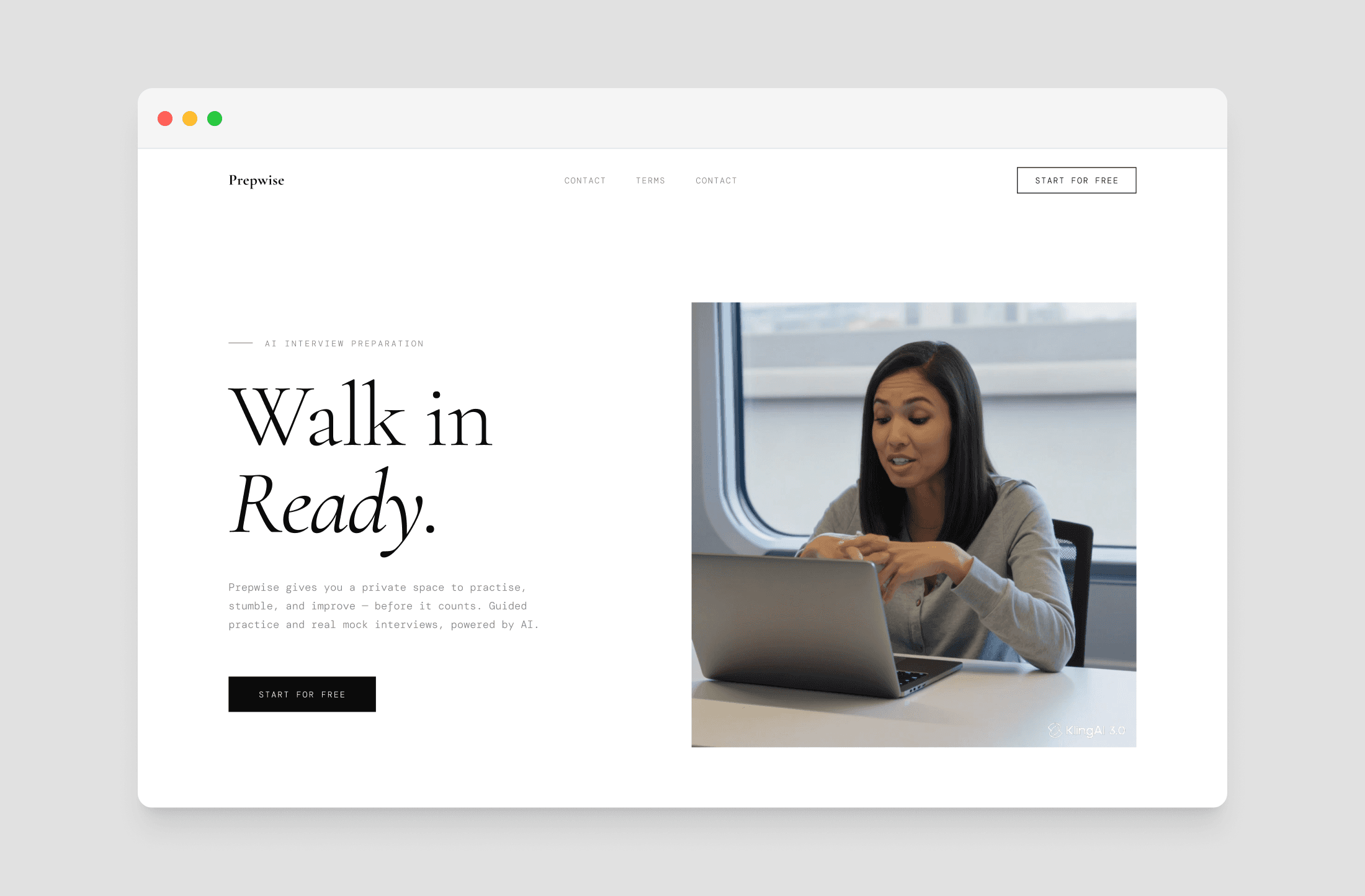
While users have grown accustomed to scrolling through websites, the hero section remains the most critical space for delivering your core message. Instead of the conventional approach of featuring a static product screenshot or video thumbnail, I wanted to lead with the essence of what makes Prepwise stand out — its convenience and versatility. To bring this to life, I experimented with Kling AI to produce a dynamic video reel showcasing real users engaging with Prepwise across multiple devices and in a variety of locations.
While users have grown accustomed to scrolling through websites, the hero section remains the most critical space for delivering your core message. Instead of the conventional approach of featuring a static product screenshot or video thumbnail, I wanted to lead with the essence of what makes Prepwise stand out — its convenience and versatility. To bring this to life, I experimented with Kling AI to produce a dynamic video reel showcasing real users engaging with Prepwise across multiple devices and in a variety of locations.
While users have grown accustomed to scrolling through websites, the hero section remains the most critical space for delivering your core message. Instead of the conventional approach of featuring a static product screenshot or video thumbnail, I wanted to lead with the essence of what makes Prepwise stand out — its convenience and versatility. To bring this to life, I experimented with Kling AI to produce a dynamic video reel showcasing real users engaging with Prepwise across multiple devices and in a variety of locations.
The Product
The product display was intentionally moved to the next section, as showcasing the actual product and its ease of use remains essential. The reel highlights Prepwise's two core features, Practice Mode and Mock Interview, giving users a firsthand look at the real UI, including session analysis and scoring. This approach allows potential users to immediately grasp the tool's value before ever having to create an account.
The product display was intentionally moved to the next section, as showcasing the actual product and its ease of use remains essential. The reel highlights Prepwise's two core features, Practice Mode and Mock Interview, giving users a firsthand look at the real UI, including session analysis and scoring. This approach allows potential users to immediately grasp the tool's value before ever having to create an account.
The product display was intentionally moved to the next section, as showcasing the actual product and its ease of use remains essential. The reel highlights Prepwise's two core features, Practice Mode and Mock Interview, giving users a firsthand look at the real UI, including session analysis and scoring. This approach allows potential users to immediately grasp the tool's value before ever having to create an account.
Modes
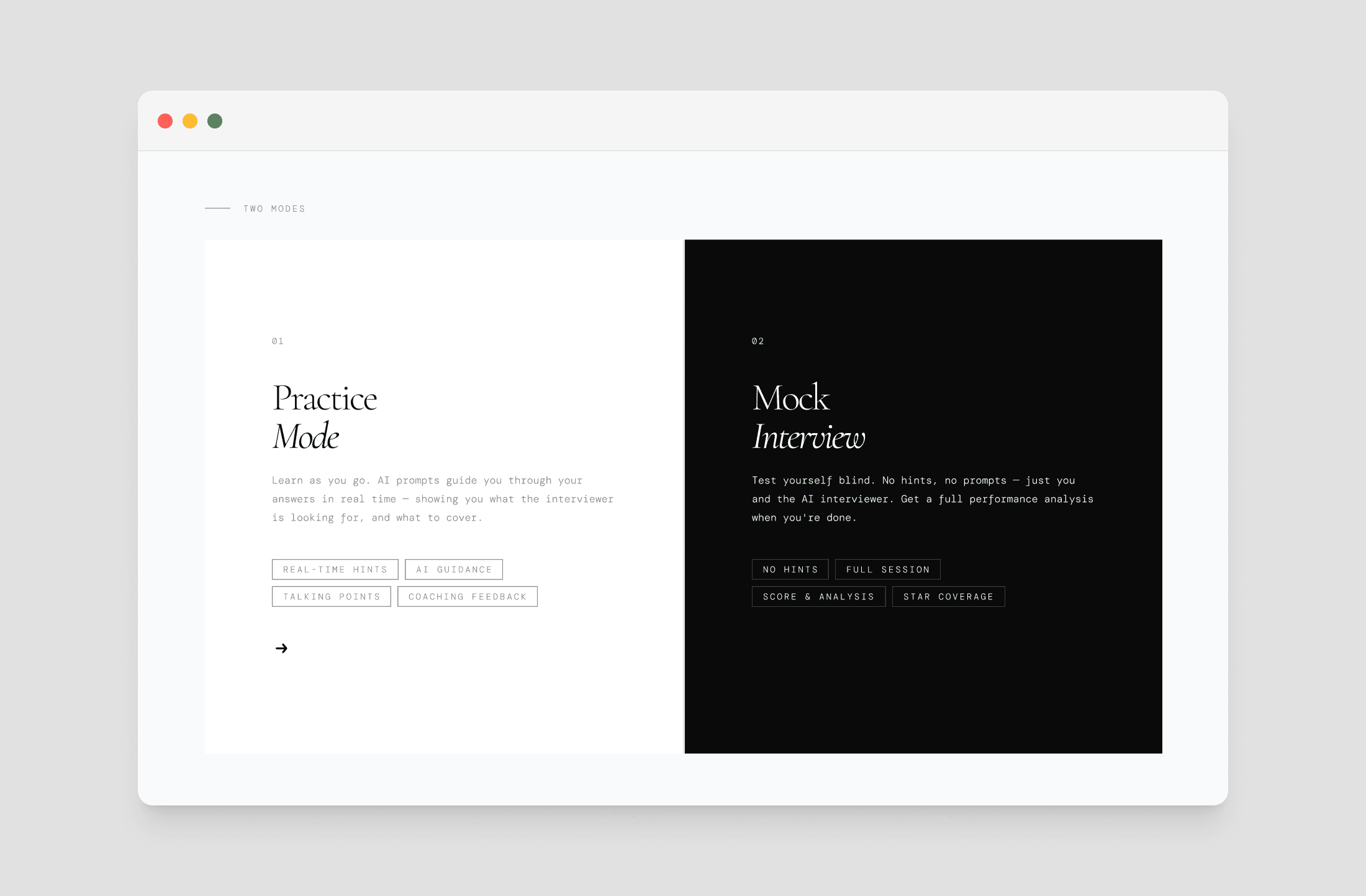
What sets Prepwise apart is the combination of two distinct modes in one place. Practice Mode focuses on learning, offering users real-time AI guidance, hints, and talking points as they speak. Mock Interview, on the other hand, simulates a real interview with no assistance, followed by a detailed performance analysis. While most competing tools take an either/or approach, Prepwise brings both together, making it important to highlight this as a core advantage of the product.
What sets Prepwise apart is the combination of two distinct modes in one place. Practice Mode focuses on learning, offering users real-time AI guidance, hints, and talking points as they speak. Mock Interview, on the other hand, simulates a real interview with no assistance, followed by a detailed performance analysis. While most competing tools take an either/or approach, Prepwise brings both together, making it important to highlight this as a core advantage of the product.
What sets Prepwise apart is the combination of two distinct modes in one place. Practice Mode focuses on learning, offering users real-time AI guidance, hints, and talking points as they speak. Mock Interview, on the other hand, simulates a real interview with no assistance, followed by a detailed performance analysis. While most competing tools take an either/or approach, Prepwise brings both together, making it important to highlight this as a core advantage of the product.
How it Works
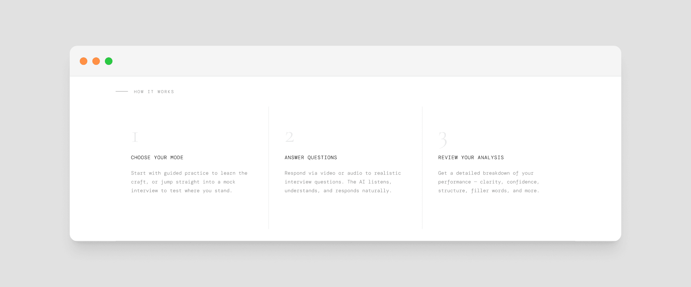
This section was designed to reassure users that getting started is straightforward. By breaking the journey down into three simple steps, Choose Your Mode, Answer Questions, and Review Your Analysis, the goal was to make the process feel approachable and effortless rather than overwhelming.
This section was designed to reassure users that getting started is straightforward. By breaking the journey down into three simple steps, Choose Your Mode, Answer Questions, and Review Your Analysis, the goal was to make the process feel approachable and effortless rather than overwhelming.
This section was designed to reassure users that getting started is straightforward. By breaking the journey down into three simple steps, Choose Your Mode, Answer Questions, and Review Your Analysis, the goal was to make the process feel approachable and effortless rather than overwhelming.
Social Proof
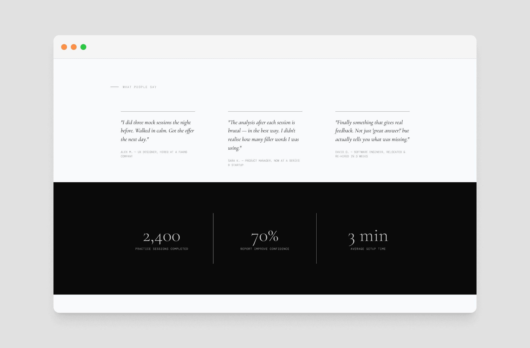
Social proof taps into the idea that people look to others when making decisions, making it especially critical for newer products trying to establish credibility. To address this, the section was built around two layers of trust. User testimonials feature direct quotes from people across diverse roles, demonstrating the tool's broad appeal and real-world impact. This is supported by key numbers that provide quantitative proof of success, giving visitors the concrete evidence they need to feel confident in the product.
Social proof taps into the idea that people look to others when making decisions, making it especially critical for newer products trying to establish credibility. To address this, the section was built around two layers of trust. User testimonials feature direct quotes from people across diverse roles, demonstrating the tool's broad appeal and real-world impact. This is supported by key numbers that provide quantitative proof of success, giving visitors the concrete evidence they need to feel confident in the product.
Social proof taps into the idea that people look to others when making decisions, making it especially critical for newer products trying to establish credibility. To address this, the section was built around two layers of trust. User testimonials feature direct quotes from people across diverse roles, demonstrating the tool's broad appeal and real-world impact. This is supported by key numbers that provide quantitative proof of success, giving visitors the concrete evidence they need to feel confident in the product.
Bottom CTA
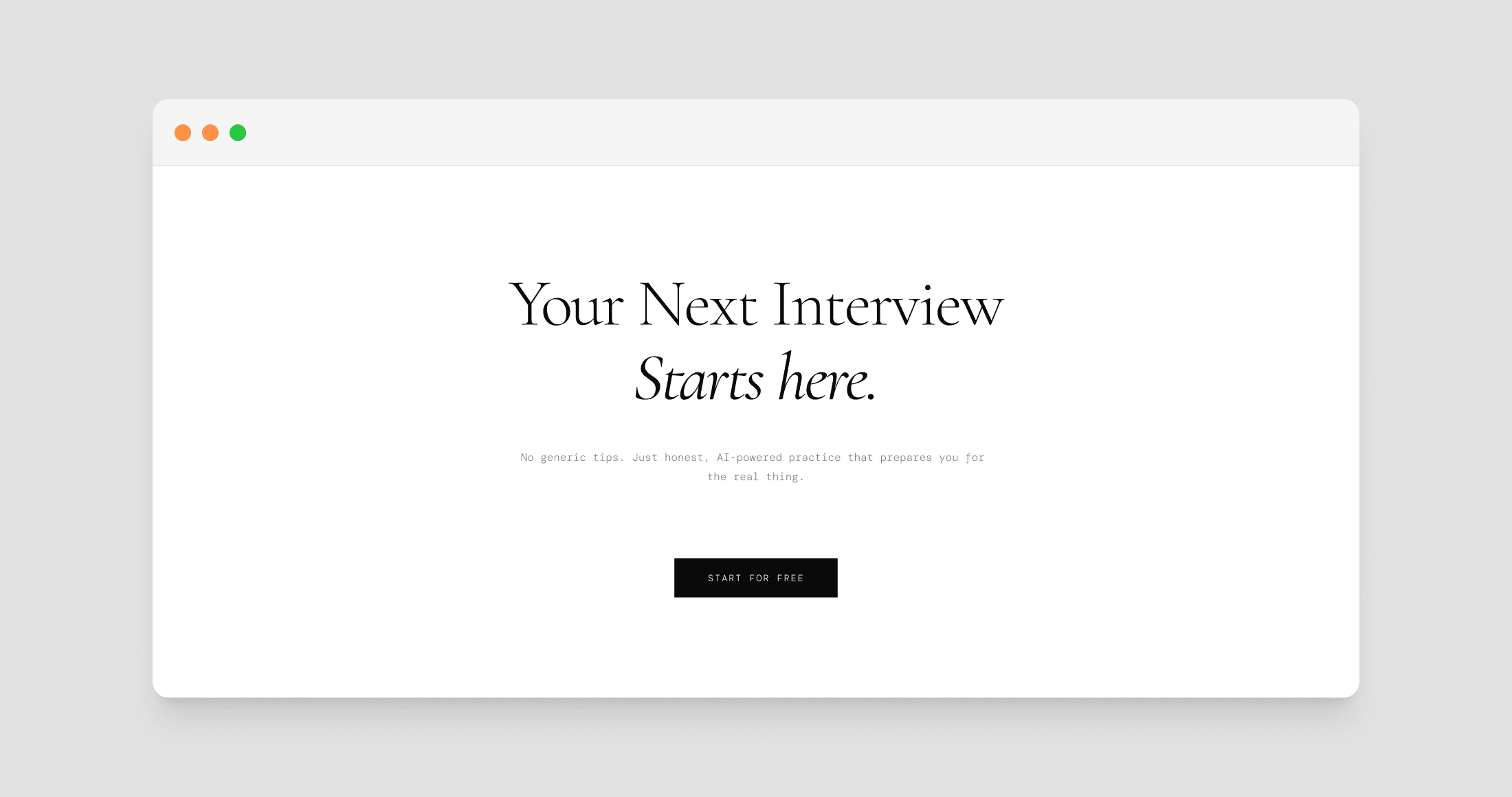
The landing page was designed around a classic sandwich strategy, opening and closing with a Call to Action. While the hero section captures users who are immediately convinced and ready to get started, not every visitor makes that decision right away. Some users need more context before committing, so they scroll through the full page to learn more. Rather than making those users scroll back to the top, a second CTA at the footer meets them exactly where they are, removing any friction between their decision and their first action.
The landing page was designed around a classic sandwich strategy, opening and closing with a Call to Action. While the hero section captures users who are immediately convinced and ready to get started, not every visitor makes that decision right away. Some users need more context before committing, so they scroll through the full page to learn more. Rather than making those users scroll back to the top, a second CTA at the footer meets them exactly where they are, removing any friction between their decision and their first action.
The landing page was designed around a classic sandwich strategy, opening and closing with a Call to Action. While the hero section captures users who are immediately convinced and ready to get started, not every visitor makes that decision right away. Some users need more context before committing, so they scroll through the full page to learn more. Rather than making those users scroll back to the top, a second CTA at the footer meets them exactly where they are, removing any friction between their decision and their first action.
Conclusion
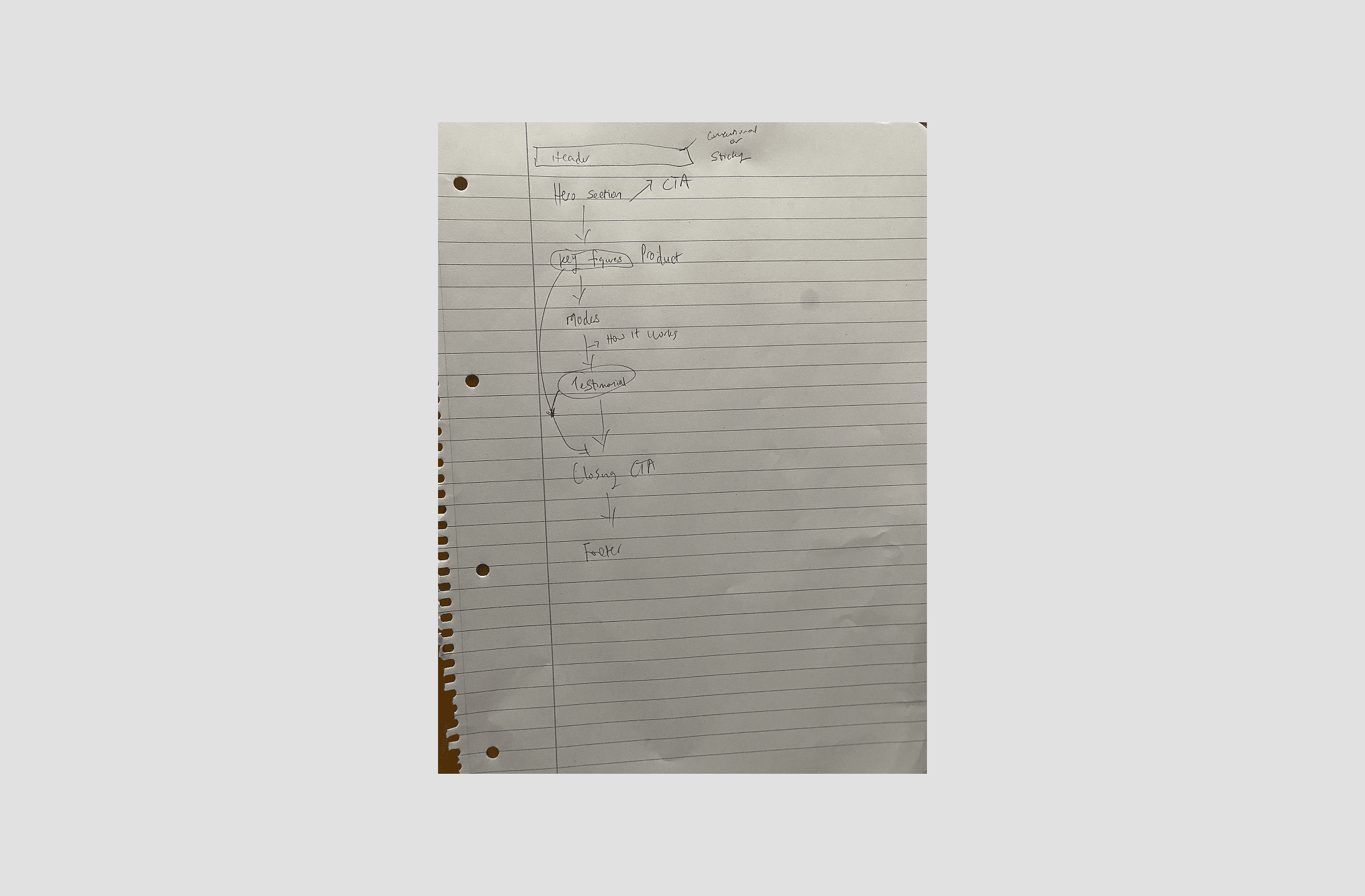
Every section of this landing page was deliberate, with no element left to chance. The flow was carefully considered, and several sections were repositioned and consolidated to arrive at the final result. A dedicated case study diving deeper into the tool itself is also on the way.
Every section of this landing page was deliberate, with no element left to chance. The flow was carefully considered, and several sections were repositioned and consolidated to arrive at the final result. A dedicated case study diving deeper into the tool itself is also on the way.
Every section of this landing page was deliberate, with no element left to chance. The flow was carefully considered, and several sections were repositioned and consolidated to arrive at the final result. A dedicated case study diving deeper into the tool itself is also on the way.
Other Projects
Other Projects
Currently available for full-time roles. Let's connect and discuss how I can contribute to your team.
Sarafinny04@gmail.com
Designed by me in Framer.
Copyright
2026 Sarah Igbinosa.